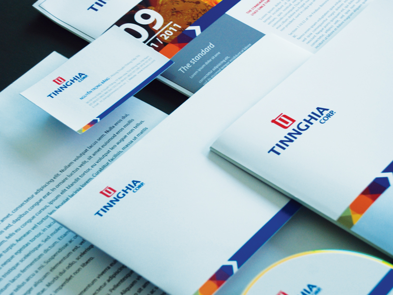
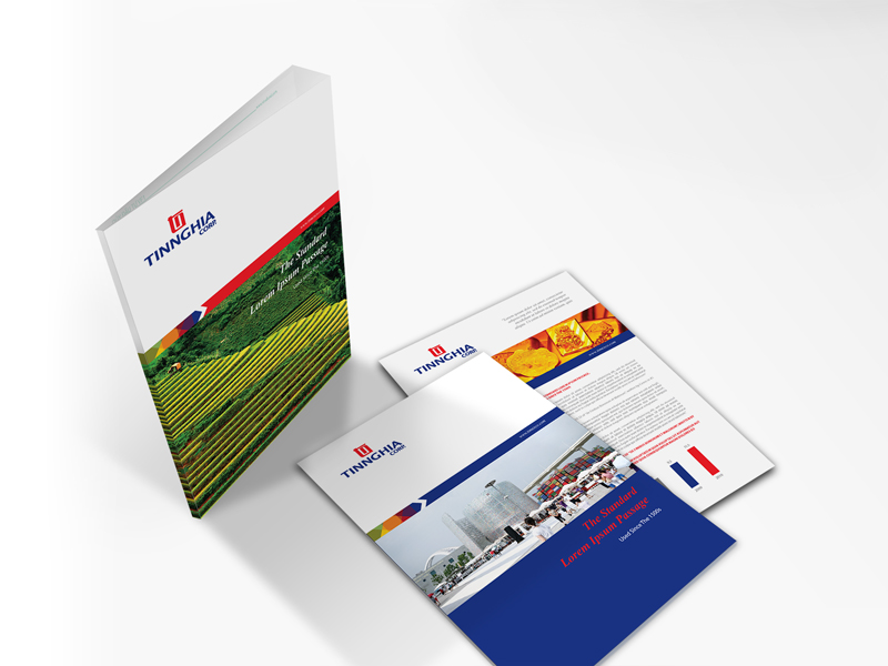
After over 20 years of continuous development, Tin Nghia Corporation needed to further affirm its position in the market.
Attention Vietnam was chosen to help develop the new corporate visual identity of the Tin Nghia brand. Tin Nghia’s management board requested to design the new visual identity around the old “tn” symbol to help sustain their communication message of solidarity and consensus. Attention Vietnam paired the stylized symbol with a strong modern typography to show a strong, prestigious and stable company. We also incorporated feng shui principles in the design and this is strongly reflected in the identity’s red and blue color scheme which is auspicious for Tin Nghia’s chairman.


