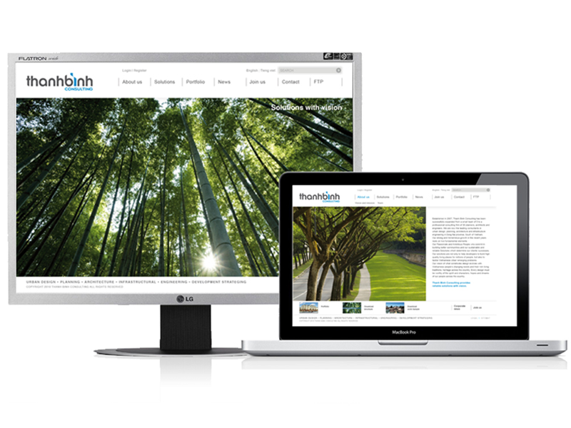
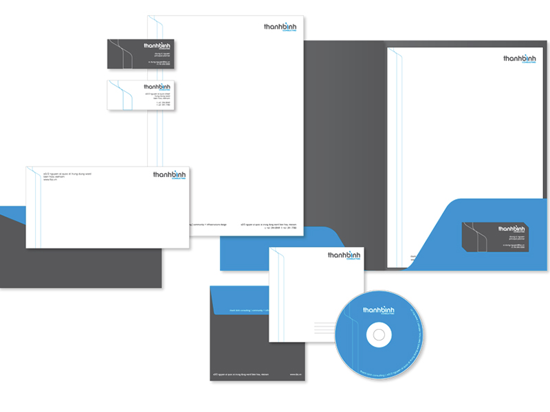
Thanh Binh Consulting is a dynamic architecture firm on the rise. They came to Attention Vietnam with the dilemma of how to standardize and make their identity more cohesive. They wanted to be seen by the industry as a focused and consistent organization with a clear aim of providing solutions with vision. It was a big challenge for Attention Vietnam to develop a logo that will represent a company comprising of young individuals full of fresh ideas. We came up with a logo that is rooted in design history yet shows the ardor of the company. The typography is inspired by the Bauhaus movement which has been modified to be more contemporary to show the technical nature of Thanh Binh Consulting. Attention Vietnam also opted to use cool bold colors in the visual identity to emphasize their zeal in their goal of contributing to the urbanization of Vietnam.


