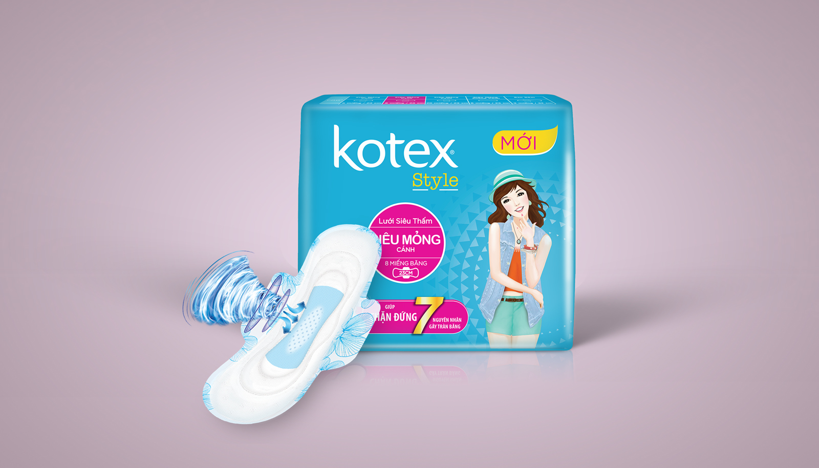
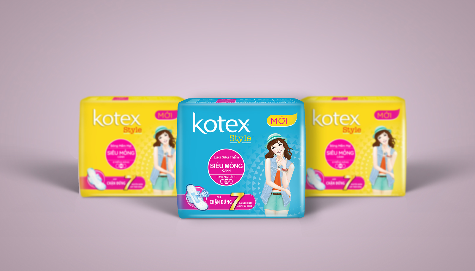
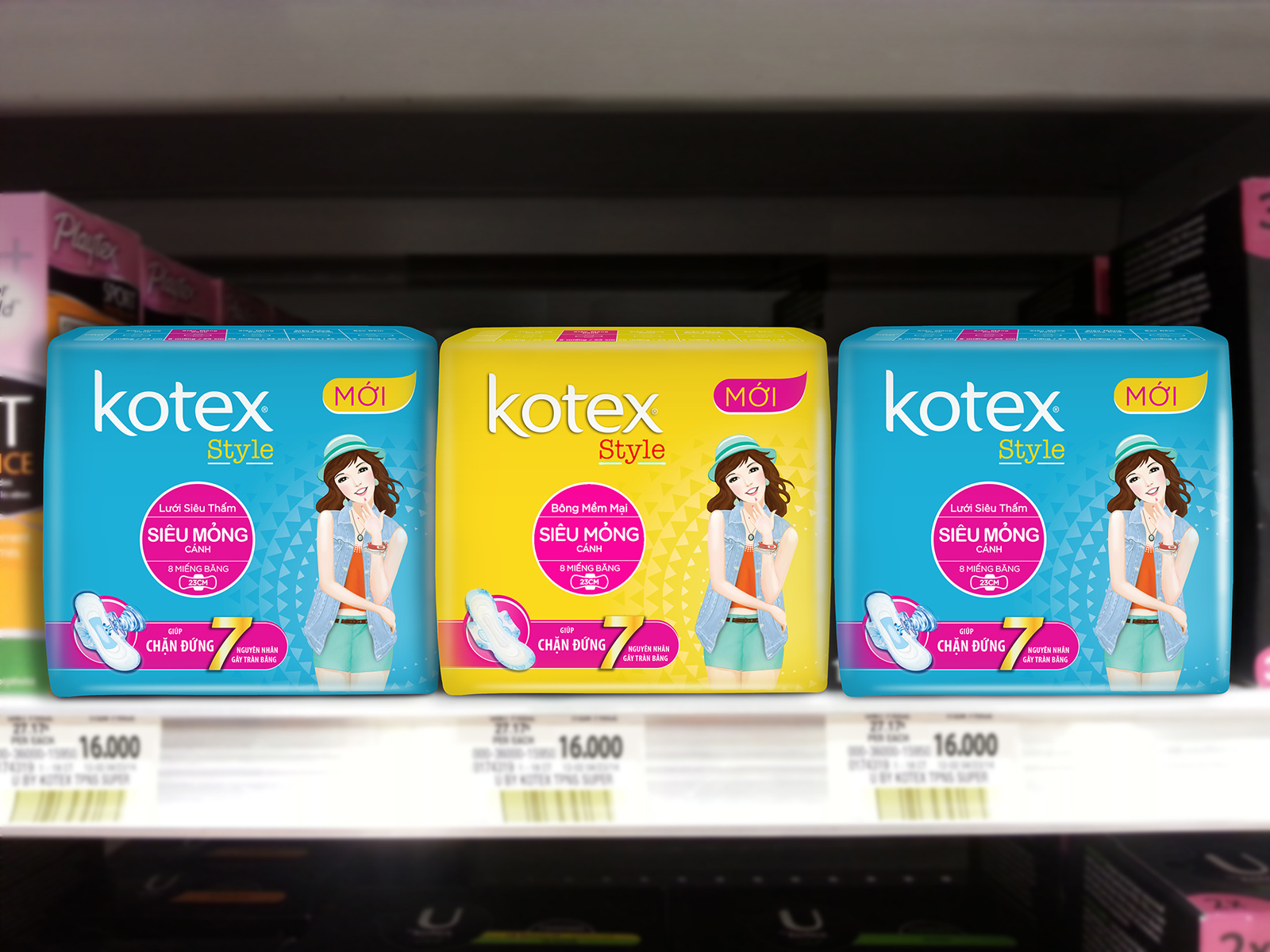
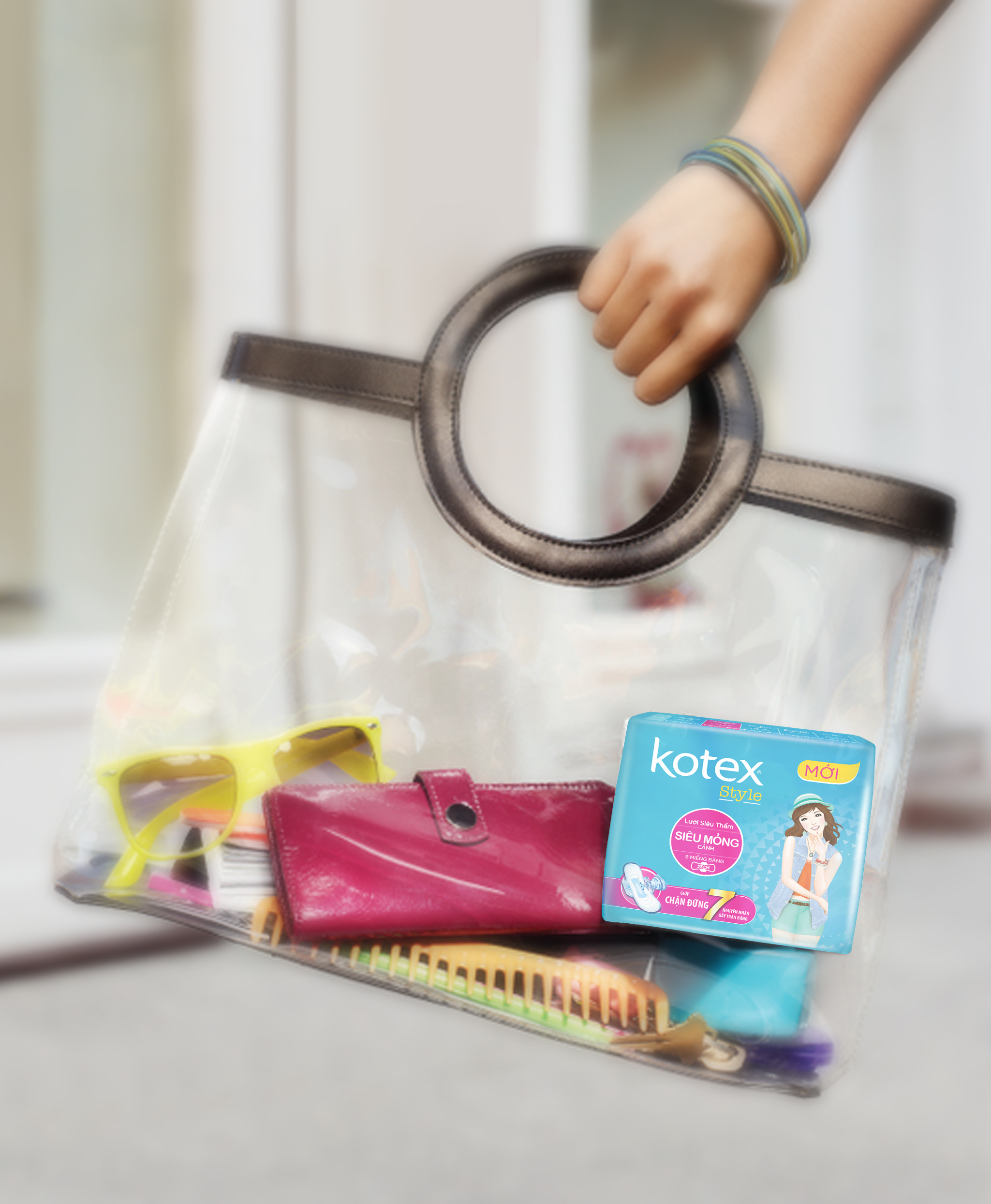
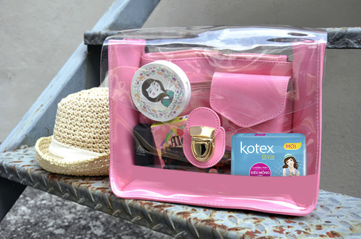
Kotex is a brand of feminine hygiene products, which includes various types of pads and tampons. Kotex is owned and managed by Kimberly-Clark, a corporation active in more than 150 countries. Kotex reached out to Attention Vietnam for making them a new brand implantation and also design a new character and packaging. Kotex wanted to have a new packaging design but without any drastic change that may destroy the familiarity of Kotex in consumers mind. Attention Vietnam task was to improve the weakness of the products functional cues on current packaging through adding STOP7 benefit. Attention Vietnam changed the background with new graphic but avoided cluttering. They renewed the functional cue with combining current blocking with STOP7 icon. Adding a ‘’New’’ line to the corner of the packaging will trigger the consumers. Attention Vietnam refreshed the girls look on the packaging without changing her personality. They didn’t change the blue color background of Kotex and also kept the girls hat and accessories. The girls image on the packaging didn’t change, it still remained confident (her face), active (shorts), comfortable (smile, posing) and stylish (mix-match layers, accessories…). Attention Vietnam renewed her outfit with more up-to-date and fashionable clothes. They made here look more mature and having a purpose look (wearing a bag for school= be educated). The whole packaging design is well harmonized

