VIETCOCO IDENTITY & PACKAGING
From Coconut Fields to Premium Consumer Brand
Logo Showcase Variations Developed
Product Lines with Unified Packaging
Logo, Brand Identity & Packaging System
How do you transform a coconut commodity producer into a premium consumer brand — with a visual identity that works from logo to shelf, from cosmetics to organic food?
Lương Quới — Vietcoco
SCOPELogo Design, Brand Identity, Packaging Design, Visual Identity
“Vietcoco brings the purity of Vietnam's coconut heritage to every product — from virgin coconut oil to organic coconut water, from cosmetic lines to cooking essentials.”
Brand Story
Vietcoco
FROM COMMODITY TO BRAND
Vietcoco, part of Lương Quới — one of Vietnam's largest coconut product manufacturers — had the production capability and product quality, but lacked a cohesive brand identity that could elevate them from commodity supplier to consumer brand. The challenge was to create a complete visual system that could span across vastly different product categories while maintaining brand cohesion. Attention was tasked with building the entire brand from the ground up: logo, identity system, and packaging architecture.
THE LOGO & BRAND IDENTITY
We developed a logo system that captures the essence of Vietcoco — the natural purity of coconuts combined with Vietnamese craftsmanship. The logo mark draws from the organic forms of the coconut palm and the clean geometry of modern brand design. The logo showcase presents the brand mark across six distinct applications, demonstrating the versatility and recognizability of the identity across different contexts and backgrounds. The brand identity system establishes a visual language that is simultaneously natural and premium.
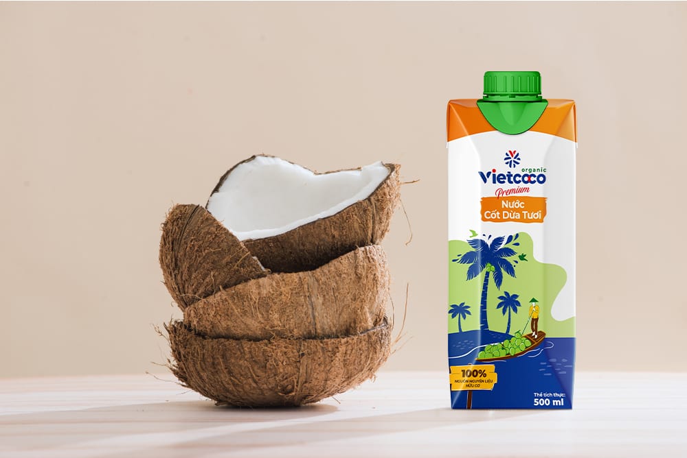
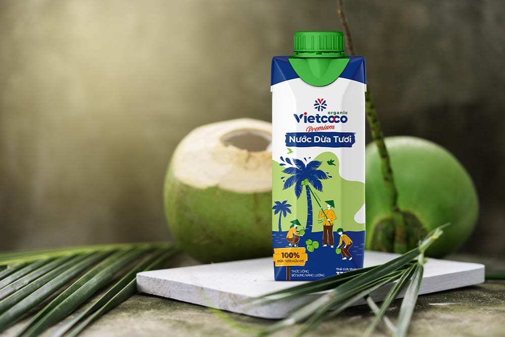
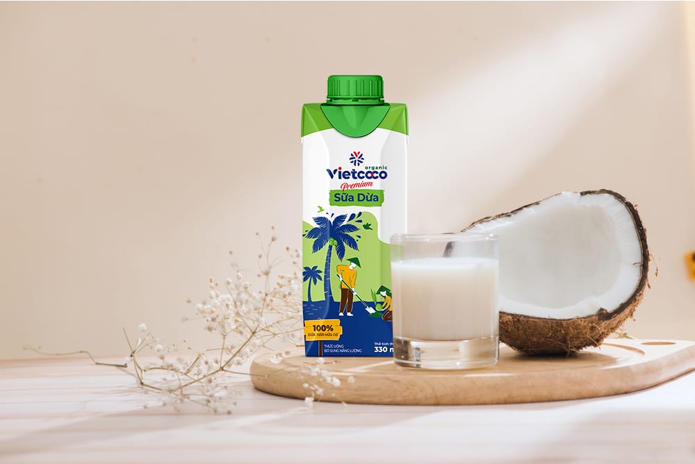
PACKAGING ARCHITECTURE
The packaging system was designed as an architecture of trust and quality. Each product line — from Organic virgin coconut oil to coconut-based cosmetics — received its own visual treatment within the Vietcoco family. Clean white backgrounds, natural imagery, and the distinctive green brand color create immediate shelf recognition while allowing each product to tell its own story. The packaging architecture ensures that whether a consumer picks up coconut water or coconut oil, the Vietcoco brand promise is immediately clear.
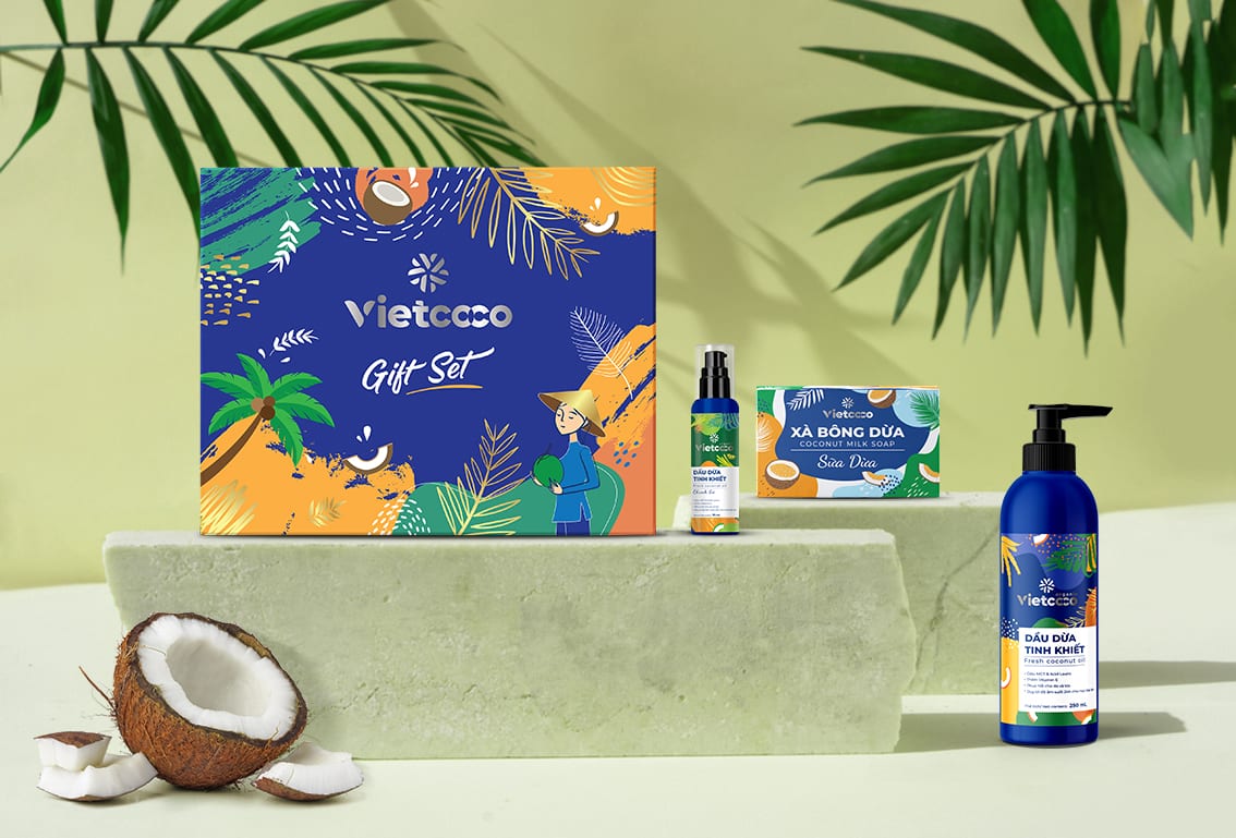
COSMETIC LINE EXCELLENCE
The cosmetic sub-brand demanded a particularly refined approach. We created packaging for soaps, shampoo, and body lotions that communicates premium natural beauty — the kind of design that sits comfortably on a department store shelf while remaining authentically Vietnamese. The hop-bokit, xà bông, and dầu dừa chanh xanh product lines each have distinct personalities within the cohesive system, yet every item unmistakably belongs to the Vietcoco family.