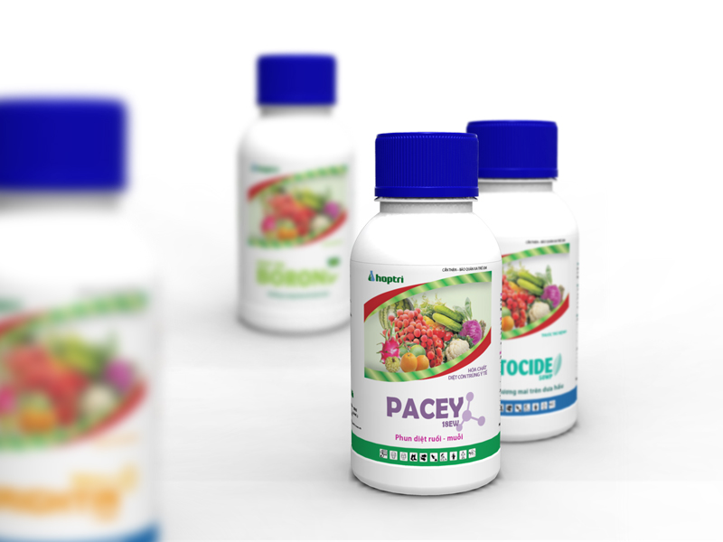
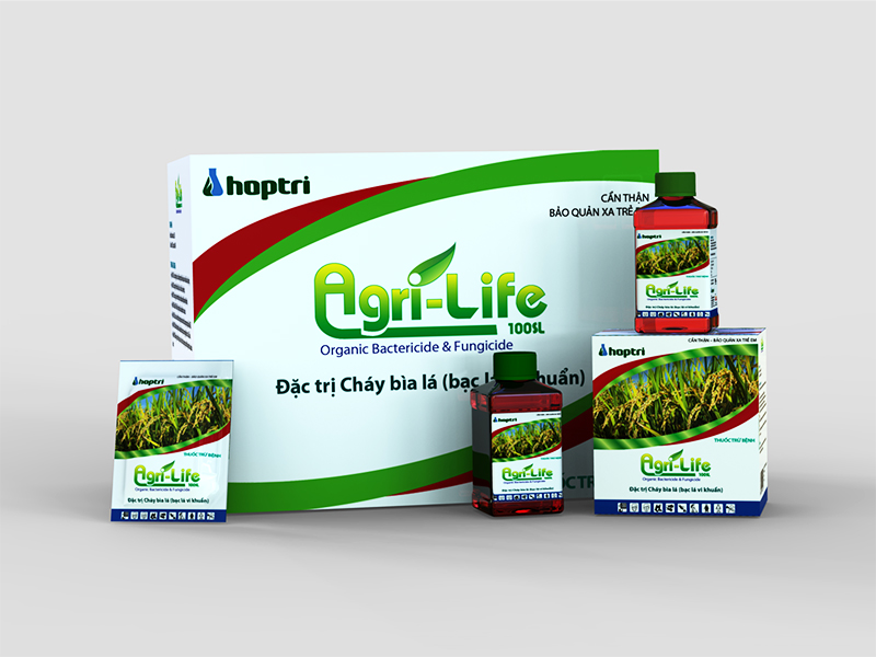
Hop Tri Agrochemicals, established in 2003, is a professional in the fields of research and applied sciences with the ultimate goal of helping the progress of agriculture in Vietnam. With the strategy to become the industry standard and at the same time be a dynamic company with sustainable development, Hop Tri cooperated with Attention Vietnam to create a consistent brand identity and packaging design system to enhance the company’s corporate value in the market.
With the company’s belief in sustainable agriculture that is also environmentally friendly, Attention Vietnam created a brandmark with leaves that spring forth from the flask. It shows that it is starting new life that will only flourish and grow stronger. The leaves also form the shape of a hand that cradles the flask — showing nature supporting science — which is symbolic of Hop Tri creating high quality products to serve the community. It also creates a strong image that is a representation of the corporate name. A custom font has been created for our wordmark with a cool color palette that is in line with our goal of creating a fresh and friendlier identity.


